Create web page layouts that adapt to each user’s screen resolution.
On its own, the jQuery Mobile framework is a great solution for quickly creating an accessible, HTML5 markup-driven mobile website. When paired with CSS3, things really get interesting, as it becomes possible to create web page layouts that respond to a user’s device based on the screen resolution. This article shows how to use the jQuery Mobile framework and CSS3 media queries to implement responsive design with jQuery Mobile in your web pages.
The jQuery Mobile framework is a JavaScript library that you can use to easily create a mobile version of a website, converting existing web pages into touch-friendly websites and applications. The jQuery Mobile framework is arguably going to change the way mobile applications are accessed and distributed on mobile and tablet devices by allowing users to connect directly to touch-friendly applications through a web browser. There are other options for mobile development, but the difference with the approach that jQuery Mobile is taking is that they are targeting a large variety of mobile platforms.
The smartphone and tablet device adoption rate is skyrocketing, and the jQuery Mobile framework is helping developers meet the growing demand for mobile web experiences. Providing mobile web experiences requires a new set of skills from web developers and designers. In 2010, Nielsen projected that one in two Americans would have a smartphone (see Resources for a link to the blog), which is a huge increase compared to just one in 10 in 2008, and in June 2011, AMI-Partners forecasted that “tablet adoption among businesses with between 1 and 1,000 employees will grow by 1,000 percent by 2015” (see Resources for a link to the full forecast). With these increases in adoption rate, there will be a strong demand for web developers and designers who can create mobile web experiences. The jQuery Mobile framework is a great solution for creating mobile web experiences, as it increases the speed in which mobile websites can be produced and supports a wide variety of mobile platforms.
Pitfalls and solutions
The jQuery Mobile framework is a great solution for creating a mobile or tablet version of your web pages, but it completely relies on the content of a website to be appended with certain data-role attributes. In rare cases, it may not be possible to append these attributes to your HTML markup and can require you to create a separate mobile website. However, this article shows you how, with a little foresight and planning, it is possible to use a combination of the jQuery Mobile framework and Cascading Style Sheets version 3 (CSS3) media queries to create a responsive design and determine how the layout reacts to a user’s device. The purpose is to create a single website that can dynamically respond to users’ devices by displaying an appropriate layout for their screen resolution.
A responsive design is one that responds to a user’s device based on its screen resolution. This means that regardless of whether a user is viewing a web page on a mobile, tablet, or desktop device, the design will respond to the device appropriately by displaying a specific layout based on that device’s screen resolution. Although the jQuery Mobile framework provides a way to quickly and easily create a mobile version of a website, it does not currently (and most likely never will) provide an inherent way to dynamically respond to the user’s device based on its screen resolution. In fact, the jQuery Mobile website states that the preexisting Media Query Helper Classes feature has been deprecated in beta and removed from the latest version. The framework’s creators are actually recommending the use of CSS3 media queries, instead. With a combination of CSS3 media queries and the jQuery Mobile framework, it is possible to achieve a responsive design that accommodates mobile, tablet, and desktop environments. The framework documentation actually uses a combination of the jQuery Mobile framework and CSS3 media queries to achieve its own responsive design. The documentation is actually quite similar to the example that you will be creating in this article in the way that it reacts to different screen resolutions.
CSS has included device-related coding measures since version 2.1 through the use of media types. A common way to use media types is to define a separate style sheet for a desktop computer screen versus a style sheet for a printed version of the web page. CSS3 has taken the concept of device-related coding measures a step further with the introduction of media queries. Media queries can be used to determine the type of device that is interacting with your web page as well as allowing developers to determine the physical properties of the device that is viewing your web pages. Needless to say, media queries have become a popular way to deliver a device-specific style sheet, as you can see in Listing 1, which delivers a style sheet specific to mobile and tablet devices based on the screen resolution.
<link
  rel="stylesheet"
  type="text/css"
  media="screen and (max-device-width: 799px)"
  href="mobile-tablet.css" />
The media attribute in this example contains a media type value that is set to screen and a media query (which is enclosed in parentheses). This particular media query checks to see whether the screen resolution of the user’s current device is less than or equal to 799px. If it is, this mobile/tablet style sheet is delivered; otherwise, this style sheet is not delivered. You can include multiple style sheet links within a single web page, each with its own media query to render your page differently based on as many different resolutions as you desire. The most common number of resolution-based style sheets that I’ve noticed seems to be three—one for mobile and tablet devices, one for lower-resolution desktop monitors, and one for higher-resolution desktop monitors. If you were to use the code from Listing 1, all devices that have a resolution smaller than 799px would use this style sheet, so this is a perfect example of how you could target mobile and tablet devices with one style sheet, and desktop computers with a different style sheet.
It’s also possible to use multiple media queries directly within the CSS of a single style sheet. Listing 2 shows an example of a CSS class used for a set of navigation items, which you will create later in this article. When the device’s screen resolution is 800px wide or more, the width of the navigation is set to 300px; when the screen resolution is 799px or less, the width of the navigation is set to 100%.
@media all and (min-width: 800px) {
  #nav {
    width: 300px;
  }
}
@media all and (max-width: 799px) {
  #nav {
    width: 100%;
  }
}
Another cool thing about media queries is that if you view a web page in a modern web browser that includes the CSS from Listing 2 paired with the associated HTML element, the web page will actually respond to the size of the browser, as well. Therefore, if the browser is set to a width of 799px or less, the navigation will be 100% in width; if the browser were sized to a width of 800px or greater, the navigation would be sized to 300px in width.
Becoming responsive
Media queries are a sort of conditional statement that determine what CSS is applied to a web page. Together with the jQuery Mobile framework, you can create some powerful mobile websites while maintaining a stand-alone desktop layout. By itself, the jQuery Mobile framework can be used to quickly and easily create touch-friendly websites. The framework has a slew of components that make it easy to add buttons, toolbars, dialog boxes, list views, and much more. However, when it comes to handling web page layout, CSS is still the language to go to. Luckily, as covered earlier in this article, CSS3 has introduced media queries, which provide developers with the capability to change the web page layout based on the device resolution.
In combination with the jQuery Mobile framework, you can create some responsive layouts. For the purposes of this article, I use a simple example that includes a set of navigation items and a grid. The navigation items and grid will be laid out differently based on the screen resolution. The first thing you need to do before the jQuery Mobile framework will function in your web page is embed the JavaScript files and CSS associated with the jQuery Mobile framework (see Listing 3).
<link rel="stylesheet" href="https://code.jquery.com/mobile/1.0b3/jquery.mobile-1.0b3.min.css" />
<script src="https://code.jquery.com/jquery-1.6.2.min.js"></script>
<script src="https://code.jquery.com/mobile/1.0b3/jquery.mobile-1.0b3.min.js"></script>
The jQuery Mobile framework includes a listview component that you will use to display your navigation items. To create a list view, simply add a data-role attribute to your navigation list’s ul element with a value of listview. The jQuery Mobile framework also includes a number of useful tools that allow you to create multiple-column grid layouts. In Listing 4, I’ve included a two-row grid with three columns, which is constructed by using a combination of the ui-grid-b, ui-block-a, and ui-bar classes. To learn more about the jQuery Mobile framework’s available components, see Resources.
<div data-role="content">
    <ul id="nav" data-role="listview" data-inset="true">
        <li><a href="#">Nav item</a></li>
        <li><a href="#">Nav item</a></li>
        <li><a href="#">Nav item</a></li>
    </ul>
    <div id="grid" class="ui-grid-b">
        <div class="ui-block-a"><div class="ui-bar ui-bar-e">A</div></div>
        <div class="ui-block-b"><div class="ui-bar ui-bar-e">B</div></div>
        <div class="ui-block-c"><div class="ui-bar ui-bar-e">C</div></div>
        <div class="ui-block-a"><div class="ui-bar ui-bar-e">A</div></div>
        <div class="ui-block-b"><div class="ui-bar ui-bar-e">B</div></div>
        <div class="ui-block-c"><div class="ui-bar ui-bar-e">C</div></div>
    </div>
</div>
Letters are appended to the end of some of the class names: These are theme-related letters that the jQuery Mobile framework uses to determine which theme is used to render the component. To learn more about theming with the jQuery Mobile framework, read the related article in Resources.
Now that you’ve created your web page, you can use CSS3 to create a responsive layout that dynamically adjusts based on the user’s screen resolution. Doing so is simple: Simply use the media queries that you learned about earlier in this article to determine the screen resolution, and then write CSS that specifically addresses the different scenarios. Listing 5 uses a media query that checks for a screen resolution of 800px or more and another media query that checks for a screen resolution of 799px or less. The first media query floats the navigation to the left and floats the grid to the left, so that they position themselves next to each other to fill out the wider space that is available on a higher-resolution screen. The second media query doesn’t have a float and sets the width of the navigation and the grid to 100%, which ultimately positions the navigation above the grid to accommodate smaller screen resolutions for devices such as smartphones and tablets.
@media all and (min-width: 800px) {
  #nav {
    width: 300px;
    float: left;
    margin-right: 20px;
  }
  #grid {
    width: 450px;
    float: left;
  }
}
@media all and (max-width: 799px) {
  #nav {
    width: 100%;
  }
  #grid {
    width: 100%;
  }
}
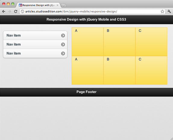
Devices with a higher screen resolution will display a side-by-side layout similar to Figure 1.
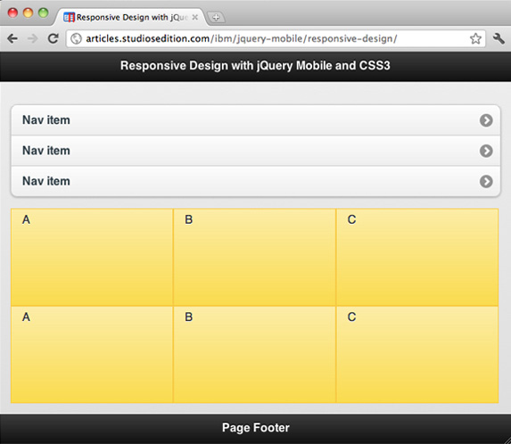
Devices with a smaller screen resolution display a side-by-side layout similar to Figure 2.
Of course, this is an incredibly simple example, but it shows how easy it is to create a responsive layout using the jQuery Mobile framework and CSS3. The possibilities are exciting, and this is just a stepping stone to get you started. By adding a few simple data-role attributes to your HTML, you can create a mobile version of your web pages; by including the CSS3 media queries, you can allow your design to respond to the user’s device based on the screen resolution. You can even alter the jQuery Mobile theme when someone views your web pages on a desktop computer so that the web page doesn’t looks like a mobile web page at higher resolutions. All you need to do is check for a higher resolution with a media query, and then change the CSS for those jQuery Mobile components to essentially overwrite the default styles that create the theme.
Conclusion
The purpose of responsive design is to display your data in the best layout possible to achieve user-friendly web pages. The combination of the jQuery Mobile framework and CSS3 can create a powerful set of layouts that you can use to respond to each user’s device.